

The Africa Cup of Nations group stage is over and, more importantly for those of us more inclined towards the aesthetics of football than we arguably should be, this means the time has come for us to review whatever kit all 24 sides were wearing.
As ever, this is a mix of the plain and the outlandish, the inspired and the awful, with everything in between. Read on, and tell us where we went wrong…
Note: Four of the five teams that were also at the 2022 World Cup are wearing the same kit, so we decided not to really waste your time or ours and have simply included here versions of what we wrote back then…
Algeria
Algeria’s forward Youcef Belaili (Kenzo Tribouillard/AFP via Getty Images)
Extremely strong ‘World Cup 1994’ vibes to this one. In fact, it’s basically identical to Argentina’s away kit from that tournament, immortalised by Diego Maradona’s manic celebration where his eyes seemed to be trying to reach down the camera and cause you – yes, you, personally – some significant damage. It’s a lovely old touch this one, with just a hint of a gold trim to offset the green and white.
Rating: 8/10
Angola
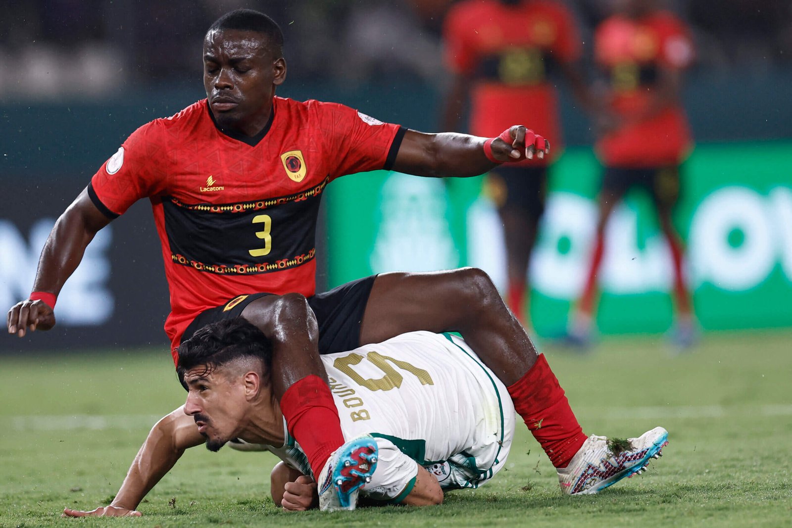
Angola defender Jonathan Buatu (Kenzo Tribouillard/AFP via Getty Images)
It could be a sign that I’ve been excessively commercialised by modern football, but this looks more like a club kit than an international one, for the sole reason that the nice thick band across the chest feels as if it’s made for a sponsor to be splashed over it. Otherwise, this is… OK. A bit… busy. A little… too much going on. There’s a different pattern above the band than below it. With another pattern on the band. That’s too many patterns. Pick your favourite one and stick with it. Let’s not over-egg the… football shirt.
Rating: 6/10
Burkina Faso
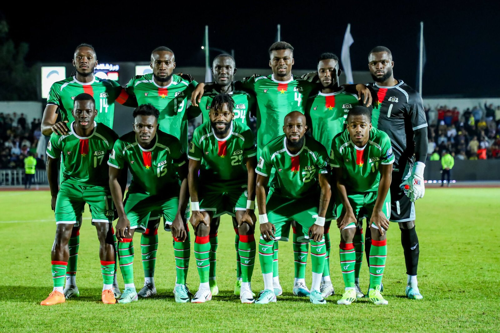
Burkina Faso (Hosein/Middle East Images/AFP via Getty Images)
In their opening game against Mauritania, Burkina Faso wore their away shirt, a classic of the old ‘give a child a big glass of Sunny Delight, two crayons and a white shirt, leave them for half an hour and see what happens’ approach to kit design. This one, their home kit, is much neater, but also somehow more vibrant without really trying to be vibrant. Plus, while it’s a bit hard to make it out from some of the pictures, we can confirm that is a horse as the background pattern. Don’t see a lot of horses on football shirts, do you? All for it, frankly.
Rating: 7/10
Cameroon
Cameroon are wearing the same kit that they did at the 2022 World Cup – this is a version of what we wrote about it then…
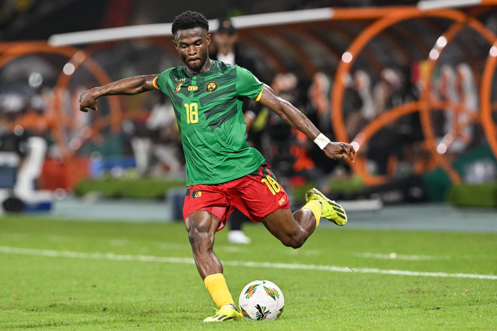
Cameroon defender Darlin Yongwa (Issouf Sanogo / AFP)
Before the World Cup, there were disputes with former kit supplier Le Coq Sportif, which left some doubts that they would actually be wearing this design, by local manufacturers One All Sports. Anyway, the design was not worth the wait. It looks a bit like a cheapish Transformers T-shirt — that background design is suspiciously similar to the Decepticons logo. Still, while the design might not be much good, the thought of Vincent Aboubakar being able to turn himself into a large articulated truck is quite an entertaining one. It’s just a shame they can’t wear the shirts they had at the last AFCON because, friends, they were beautiful.
Rating: 4/10
Cape Verde
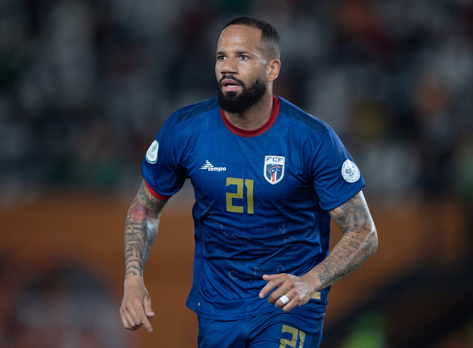
Tiago Manuel Dias Correia (Visionhaus/Getty Images)
Cape Verde caused one of the shocks of the first round of games by beating Ghana and subsequently qualified for the knockouts in some style, comfortably top of their group and four points ahead of Egypt, but was it just as important that they did so while wearing an absolutely delightful jersey? Almost certainly yes. This is reminiscent of that fantastic Ajax away shirt from a couple of years ago, the deep-blue main body complemented by a marvellous deep red, with touches of gold and white for variety. It also has the outline of the Cape Verde islands on the belly, which could look a bit like dried salty sweat marks if you didn’t know what you’re looking for, but it’s a nice touch anyway.
Rating: 8/10
DR Congo
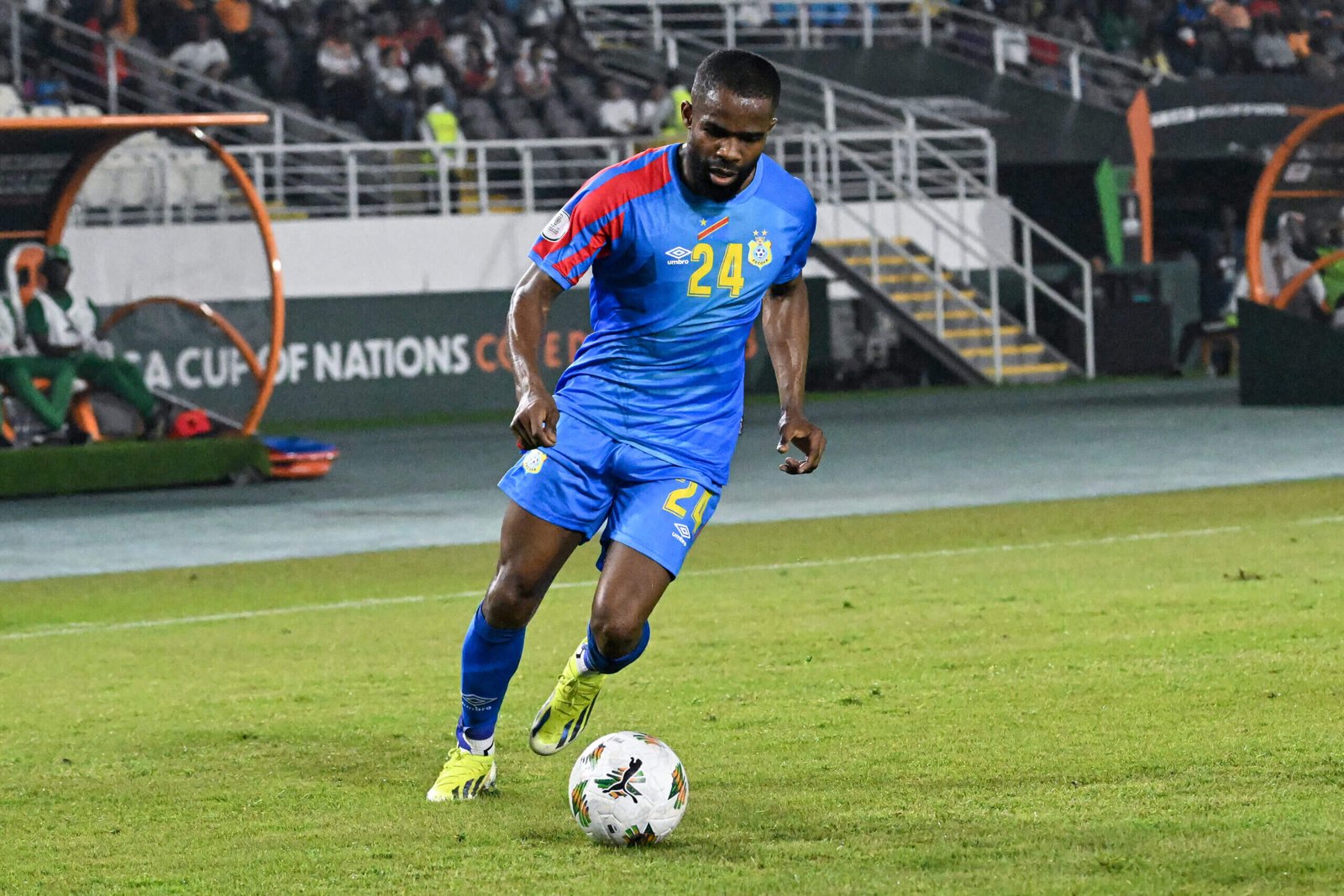
DR Congo’s Gedeon Kalulu (Sia Kambou/AFP via Getty Images)
Umbro. An old friend, who seem to be leaning quite heavily into the whole 1990s retro thing, a couple of years after it seemed to be at its peak, by selling these admittedly extremely cool drill tops. But back to the matter in hand, which is this not-quite-as-cool-but-still-pleasant Democratic of Congo shirt. It is a bit ‘primary colours’, the sort of shirt you might put on a small child who needs a lot of visual stimulation, and the pattern on the right sleeve does make it look a little like a circus big top, but none of these are necessarily bad things.
Rating: 7/10
Egypt
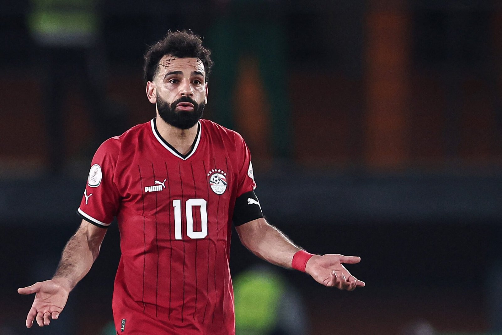
Are you ever crippled by indecision? Ever just stare at something with no clear idea what you think about it or what to do with it? Do you struggle enormously with forming an opinion about something? Welcome to my head, now. I have no idea what I think of this Egypt kit. Is it nice and clean, a triumph of simple design with just enough elements to make it notable? Or is it just really boring, for some reason I’m unable to put my finger on. I just don’t know. What’s happening? Have I become so inured to hot takes I’m unable to come up with one myself? Tell me what to think about this. I simply don’t know.
Rating: 8/10… or it could be 3/10. No idea.
Equatorial Guinea
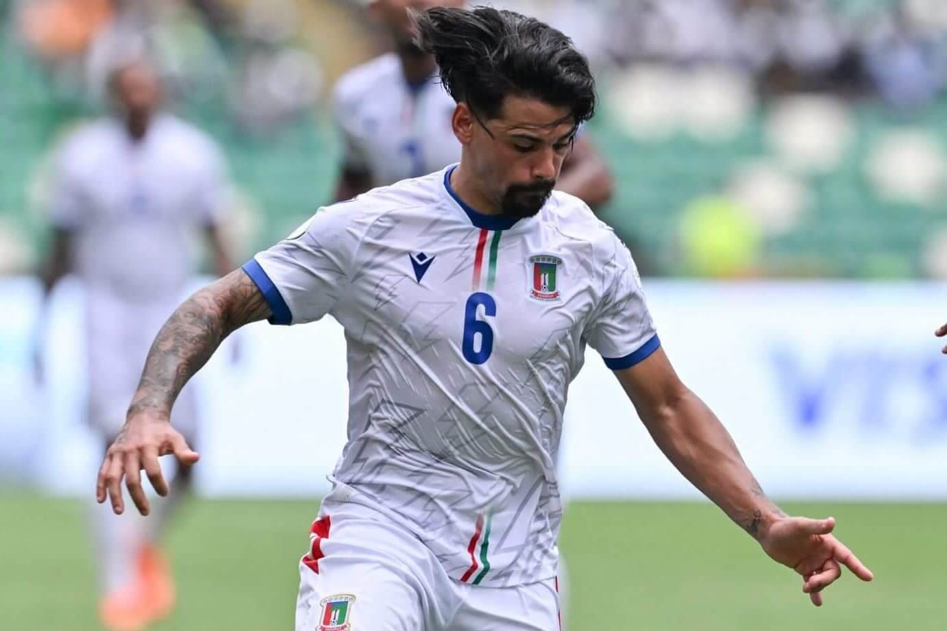
Equatorial Guinea’s Iban Edu (Issouf Sanogo/AFP)
Now, with the greatest of respect to both Equatorial Guinea and Macron (whose deal to work together was only announced on the day AFCON started) this is clearly an Italy away kit from around 2008. Which given that Macron are an Italian brand, perhaps isn’t that surprising. “The graphic theme that characterises all three kits is that of the lightning bolt,” explained the Macron press release, “echoing the nickname of the African selection Nzalang Nacional (National Lightning).” All quite route one, but pretty good nonetheless — although we should fess up here and say this is actually their away kit. Their home shirt is red, also comes complete with lightning bolts, but doesn’t really fit with the extremely amusing observation about the Italy kit. So I’ve written about this one instead.
Rating: 6/10
The Gambia
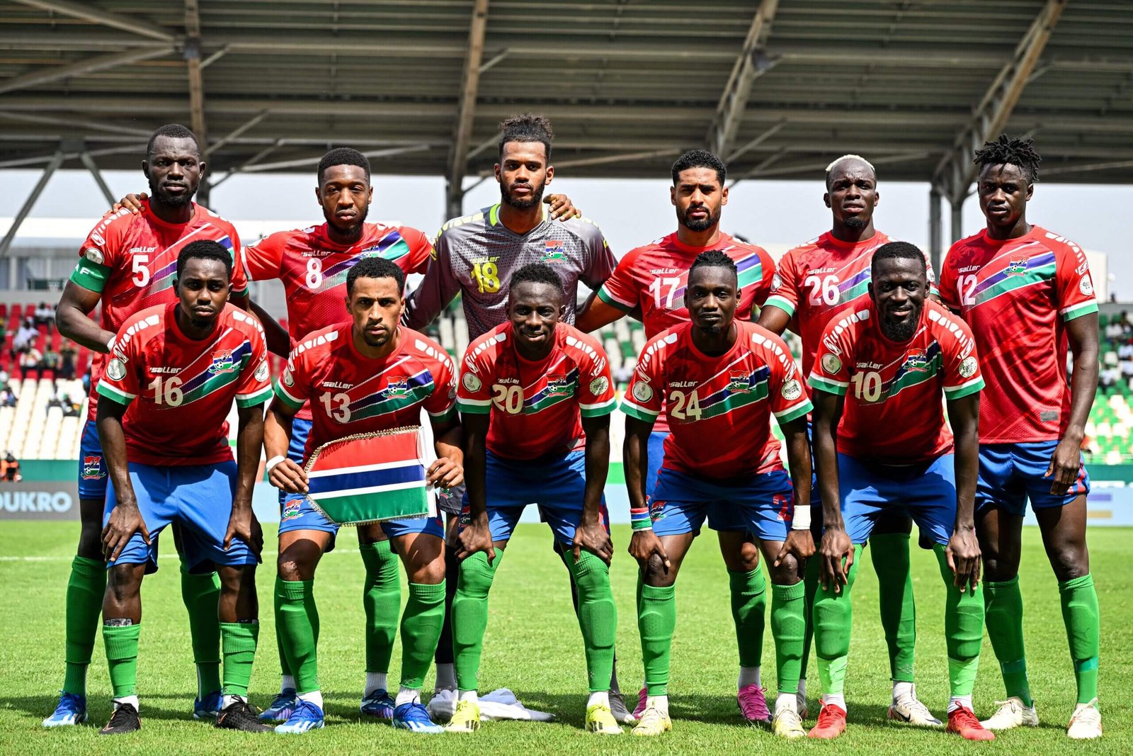
The Gambia (Issouf Sanogo/ AFP via Getty Images)
Another one with too much going on. You’ve got your big swoosh across the chest. You’ve got your shoulder detail. You’ve got your sleeve detail. You’ve got your background pattern. Two of those elements would have been fine. Three at a push. But all of them… just pick your favourites and go with that, without trying to overdo it. Plus, for some reason this combination of colours – red, deep blue, dark green, white – doesn’t really work as a football kit. It’s difficult to explain why, and the designers were obviously hamstrung by the colours of the national flag, but it just looks a bit odd. Sorry, The Gambia.
Rating: 3/10
Ghana
Ghana are wearing the same kit that they did at the 2022 World Cup — this is a version of what we wrote about it then…

Ghana’s Majeed Ashimeru (left) and Baba Iddrisu (Franck Fife/AFP via Getty Images)
Oh yes please, mother. This is a lesson in how you keep things clean and simple without being dull. Shrewd use of trim colours can make a shirt, and Puma was handed a great set of them by Ghana’s flag. This white jersey with the red, yellow and green on the sleeve, badge and collar that really pop is a delight, and while the shirt of the Black Stars featuring a black star in the middle of the chest might be a bit like the moment in some films where the title is dropped into the dialogue for no obvious reason, it works perfectly. Wonderful.
Rating: 9/10
Guinea
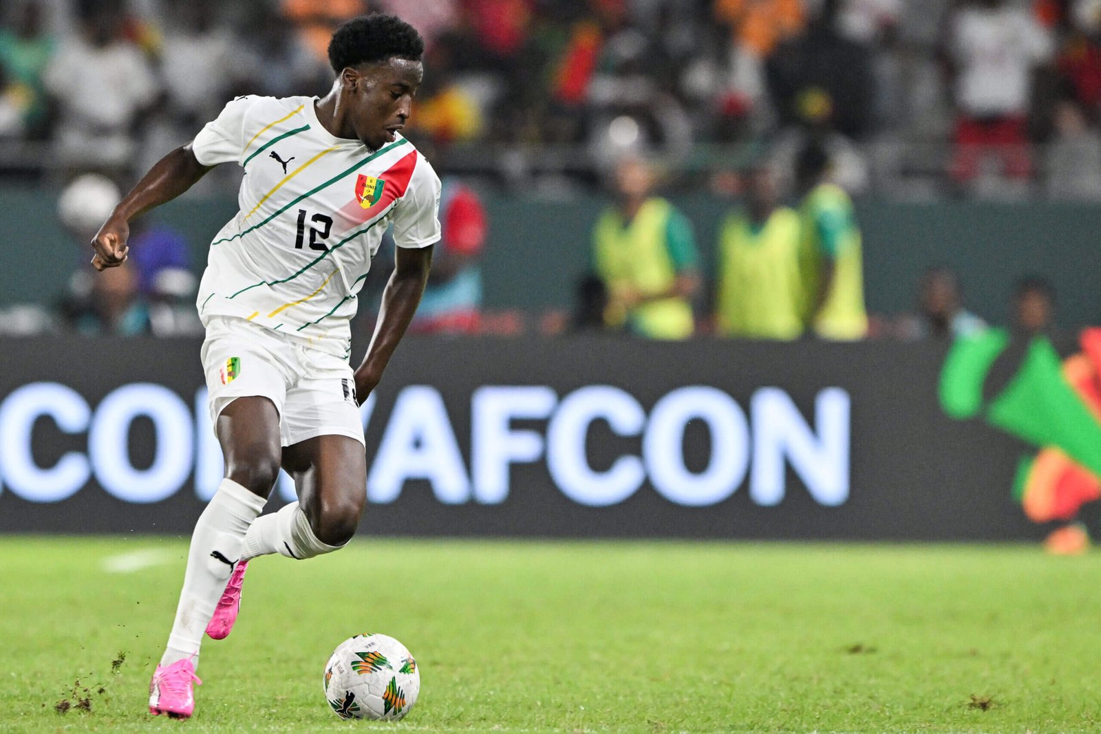
Guinea’s Ibrahim Diakite (Issouf Sanogo/AFP via Getty Images)
Ooooooh, yes please. Again, this is an away kit, which they wore in their first game against Cameroon, but the red first choice shirt is a bit boring so let’s just focus on this, much nicer number. This is a lesson in how to do clean and crisp but incorporate some colour and variety so it’s not boring. The yellow, green and reds work beautifully together and the differing angles of the yellow strips to the green is the sort of thing that possibly shouldn’t work, but somehow does.
Rating: 8/10
Guinea-Bissau
Guinea-Bissau’s Ze Turbo (Franck Fife/AFP via Getty Images)
Hmmm. Let’s talk collars. Collars on football shirts are obviously fine and can work quite well, but a collar with buttons too? I’ve been staring at this shirt for a while, enjoying the green and the patterns coming up from the waist and fading just north of the belly button, trying to put my finger on what’s wrong with it… and it’s this: it’s a cricket shirt. The collar. The buttons. Something about the font of the number on the front. This is what Guinea-Bissau should be wearing in a T20 tournament, not a football one. Which is a shame because, according to an admittedly brief Google search, Guinea-Bissau don’t seem to have a cricket team. But they do have the shirts, so that’s a start at least.
Rating: 6/10
Ivory Coast
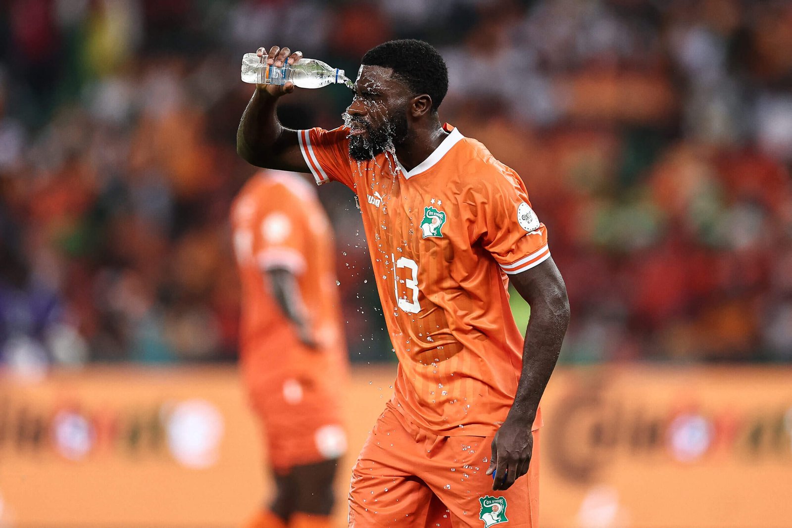
Ivory Coast’s Jeremie Boga (Franck Fife/AFP via Getty Images)
Having an orange shirt is cheating, really. Because an orange shirt is never really going to look boring. You don’t have to do a huge amount with the design to make it properly stand out. There’s really no need to mess around, and Puma have recognised that here, with a fairly minimal arrangement: just the white trim and relying on the national team crest to throw in a tiny bit more variety. In this case, less genuinely is more.
Rating: 7/10
Mali

Mali’s Lassine Sinayoko (Fadel Senna/AFP via Getty Images)
This isn’t so much a football shirt, more a chest tattoo belonging to a man who spends too much time in the gym, listening to Joe Rogan podcasts. Mali have gone for the ‘great big eagle in the middle of our shirt’ approach before, but this is something else. The eagle is there, but its wings have been super-sized and… are those marks down the side supposed to be talon slashes? If so, hats off. If you’re going to go, go hard — and this is going about the hardest you can.
Rating: 7/10 for the actual design, 10/10 for the audacity
Mauritania

Mauritania’s forward Aboubakary Koita (Kenzo Tribouillard/AFP via Getty Images)
Every time we do one of this kit ratings pieces, there’s always at least one where you wonder if it’s a simple and classic design, or just boring an unimaginative. This is very much walking that tightrope, but it’s saved by a couple of things. One is the shade of green: usually when you get green on a football shirt, it’s much more ‘primary’. The other is the spare use of the gold trim: no need to overdo it when you’ve got gold in the mix, and the shiny number on the chest, plus the scraping of colour down the left, are enough. Even if the latter does look a bit like when really posh restaurants put sort of wipe a bit of sauce on a plate to disguise the fact they’re trying to get away with a genuinely minuscule bit of beef as a ‘main course’.
Rating: 7/10
Morocco
Morocco are wearing the same kit that they did at the 2022 World Cup — this is a version of what we wrote about it then…
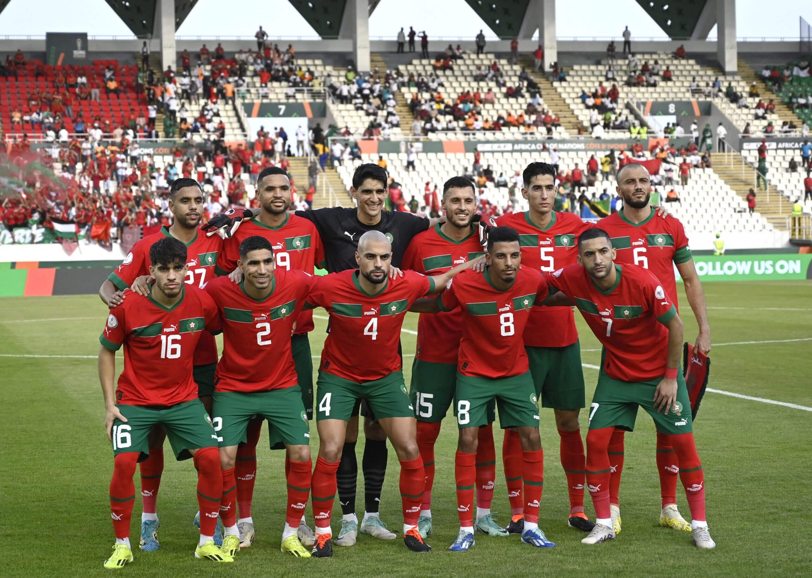
Morocco (Stringer/Anadolu via Getty Images)
This feels quite uninspiring. Possibly because it’s not so much a reference to the shirts Morocco wore at the 1998 World Cup, more an almost direct but somehow inferior copy. It’s like that shot-for-shot remake of Psycho that was made in the 1990s: a facsimile of the original, but made worse. There are small variations (the stripe across the chest doesn’t go as far onto the arms as the 1998 version, for example) but they are not sufficient to mark it out as different enough.
Rating: 5/10
Mozambique
Mozambique’s Clesio Bauque (Franck Fife/AFP via Getty Images)
Come on. Is this it? That’s what someone spent ages designing and ultimately came up with? It’s just a plain yellow shirt with black collars and cuffs. If you really peer closely you can see a bit of a background pattern, which is somehow even worse: if you have to look that closely to see it, what’s the point? It’s a shame, because while kit design might feel like a frippery (largely because, in the wider scheme of things, it is), it would be… I dunno, a sign of respect towards one of the smaller teams at the tournament to have put a bit more thought and effort into it than this. Would they have done this little for a Nigeria or Senegal or Egypt? Of course not. Lacatoni – I’m not angry, just disappointed.
Rating: 3/10
Namibia

Namibia (Fadel Senna/AFP via Getty Images)
You can see the obvious problem here: you have to try pretty hard not to make this Namibia kit not just look like a knock-off Portugal jersey. Which potentially informed some of the design choices, such as the seemingly random daubs of green and blue across the torso. It’s not especially ugly, and the collar detail is quite nice, but if you’d told me that they had just taken a maroon shirt, scrunched it up into a ball and left it in some green paint, I would believe you.
Rating: 7/10
Nigeria

Nigeria’s Victor Osimhen (Issouf Sanogo/AFP via Getty Images)
It’s brilliant, isn’t it? In theory there is far, far too much going on here, a mess of designs all squished together to the point where the background colour almost overtakes the green. A quibbler might take issue with the colour of the shorts, which all things being equal should probably be white, but that is nit-picking when you have a shirt this good. A small point: the positioning of the player’s number to the right, below the manufacturer’s logo, is inspired. I don’t really know why, but it looks so much cooler than in the middle. Maybe it was placed there for some unclear practical reason. Maybe it’s a cynical attempt to draw the eye even more to the Nike swoosh. If it is, then well done corporate America — you got me. Cover me in Cheez Whiz and call me Brody. A triumph.
Rating: 9/10
Senegal
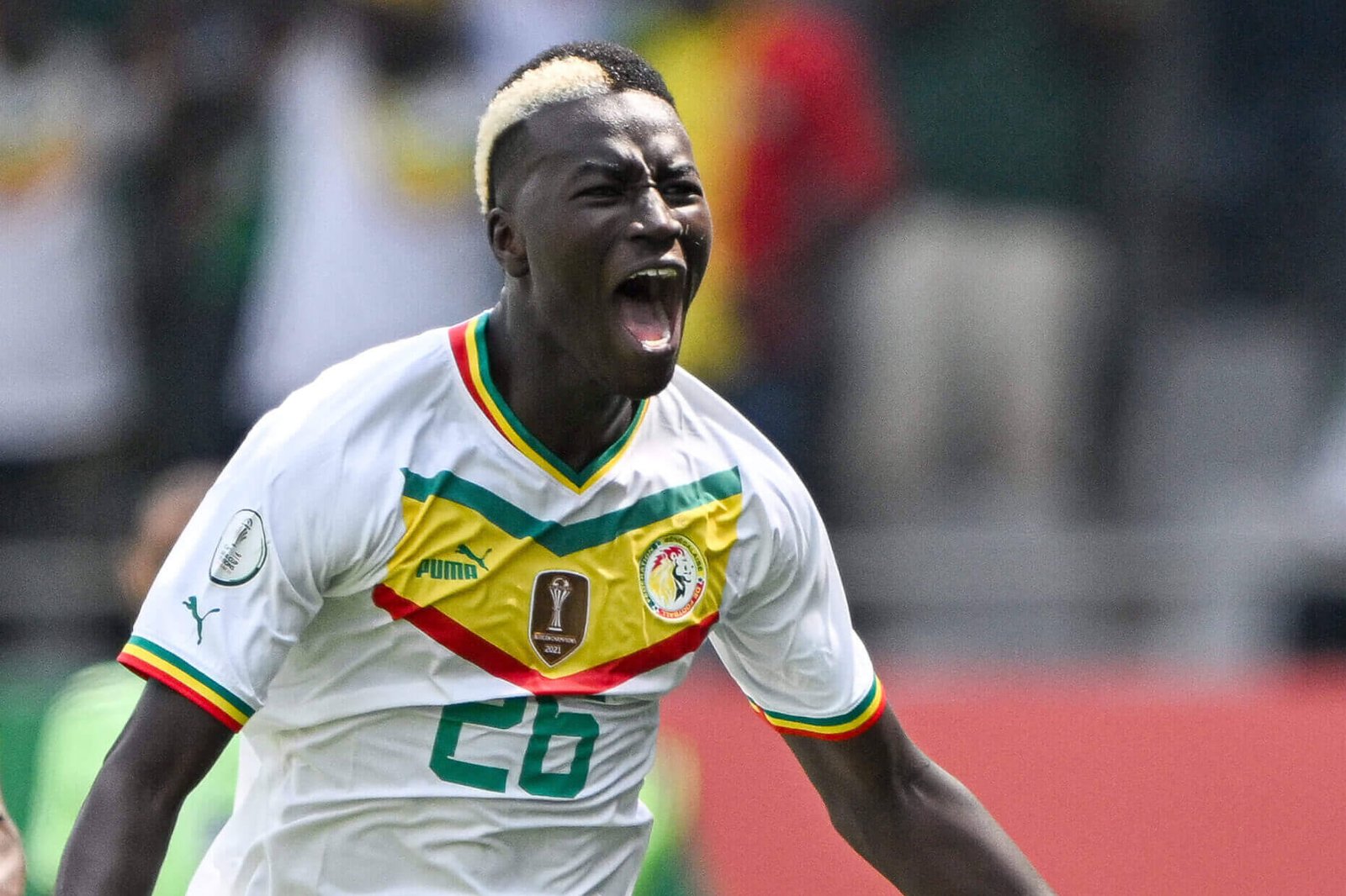
Senegal’s Pape Gueye (Issouf Sanogo/AFP via Getty Images)
Woof. This is an excellent little number, incorporating the best elements of Puma’s recent design trends without the weird bits, like the massive numbers in the middle of the chest which appear to have been consigned to the past. Admittedly, the designers have been given a significant assist here, as is the case with all countries that have a green, red and yellow flag: those colours always pop wonderfully against the bright white main body, and are used very nicely here on the collar — a sort of tapering v-neck — and cuffs.
Rating: 8/10
South Africa
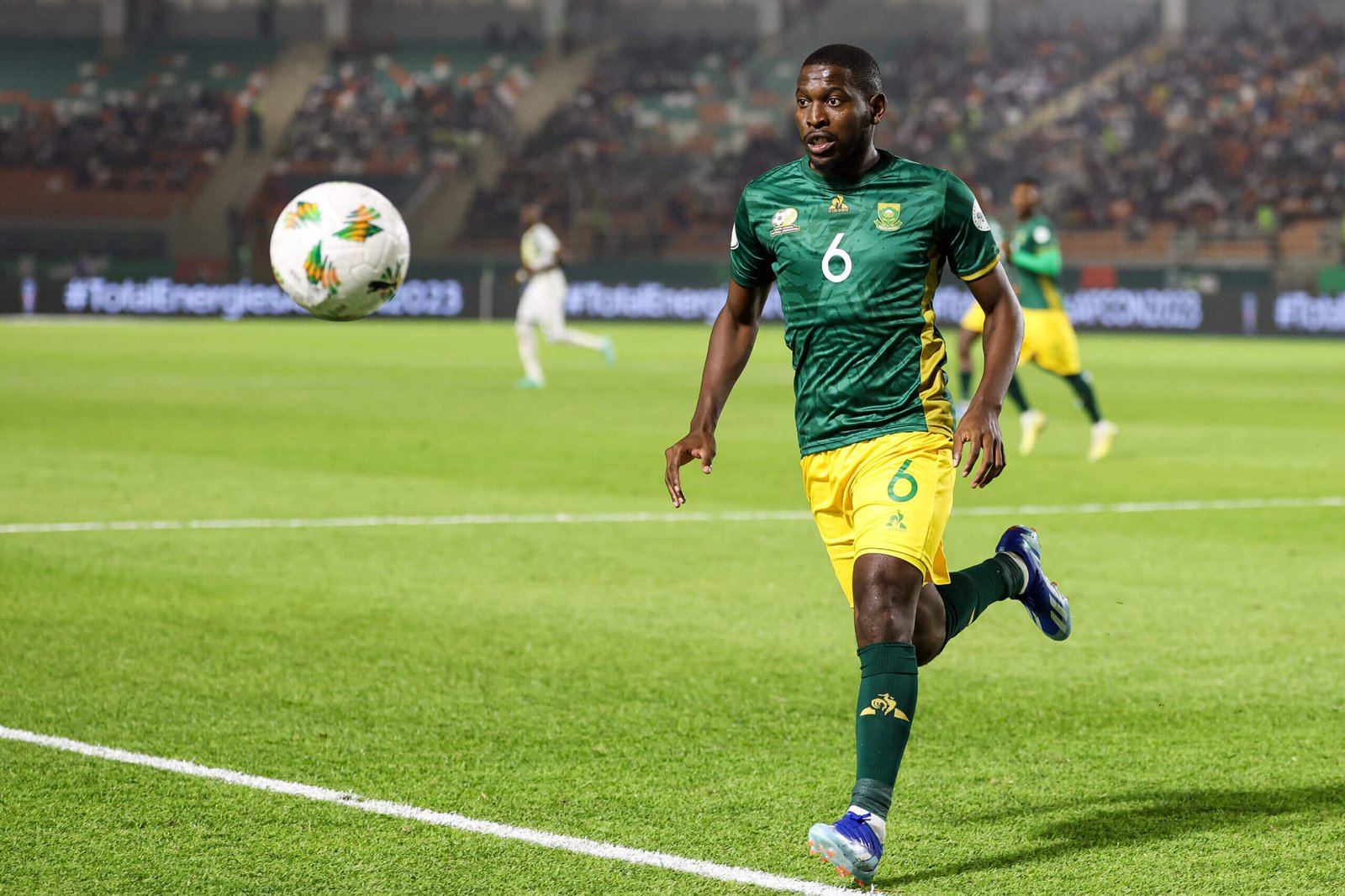
South Africa’s Aubrey Modiba (Fadel Senna/AFP via Getty Images)
South Africa men’s home jersey is the same as the women’s design, which we wrote about here. Instead, let’s have a look at the away shirt they sported against Mali and… well, it’s fine isn’t it? Not a huge amount more than that. The background pattern is both noticeable but not too obtrusive, which is what you want really, and the yellowy-gold trim works nicely, but that’s about all really.
Rating: 7/10
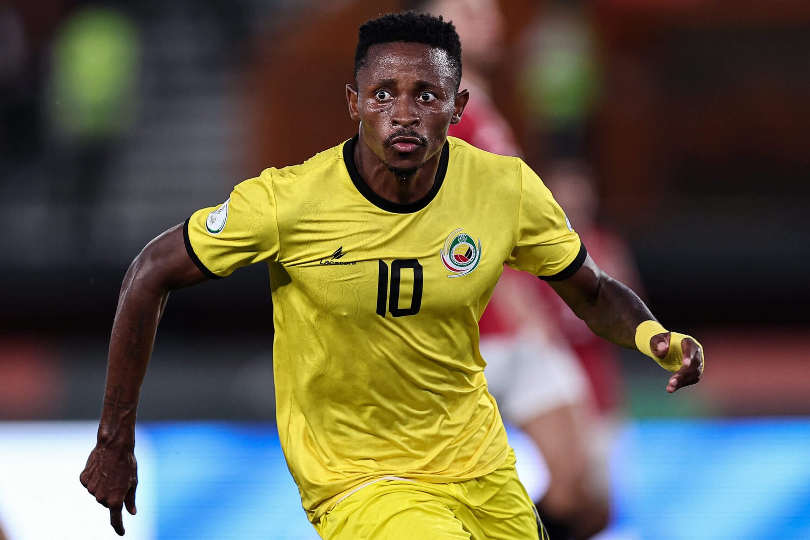
Tanzania
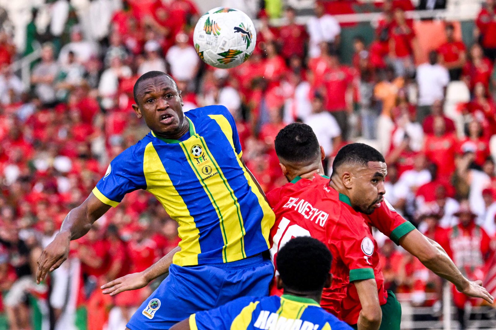
Tanzania’s Bakari Mwamnyeto (Sia Kamnbou/AFP via Getty Images)
Watching Tanzania’s first game of the tournament, against Morocco, it was quite tricky to really pay much attention to the kits, given the strength of their tackling, which they seem to have dialled up to ‘Fernando Amorebieta’ on the roughness scale. It’s a bit difficult to explain, but this shirt absolutely reeks of the sort of thing a fake footballer would wear in a shaving foam advert. You know the sort of thing: a handsome man shaves his perfect jawline, splashes water on his face and then you see him in a football shirt and he heads a generic, plain white football, before he finally strokes his smooth face. Or an attractive woman appears from nowhere, treated as a barely sentient prop, to stroke his face for him. Or something like that.
Rating: 5/10
Tunisia
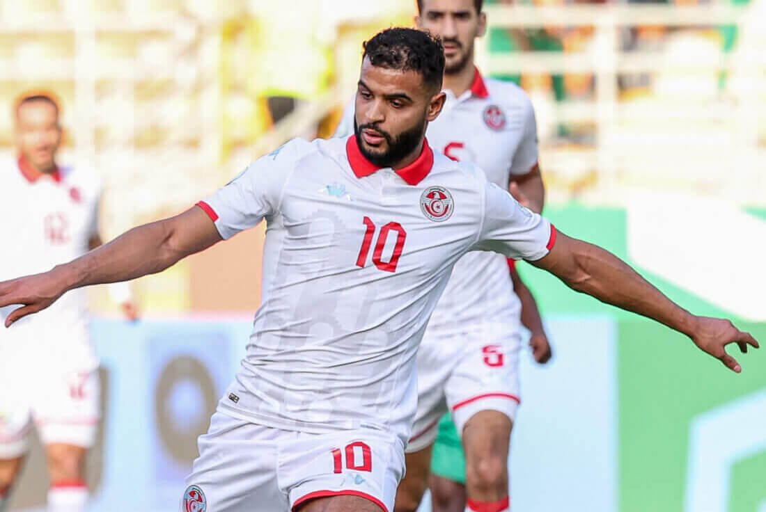
Tunisia’s Anis Ben Slimane (Fadel Senna/AFP via Getty Images)
All of the other teams at this AFCON who were also at the 2022 World Cup have kept the same kits, apart from Tunisia who have mixed things up a little. That said, they haven’t done much mixing, because it’s a white shirt with red trim, but they have at least incorporated a collar and a bit of a background pattern. But, again, that background pattern is quite hard to see, so you are left wondering why they bothered. Still, you can’t go too far wrong with classic white and red, so it was probably never going to be terrible.
Rating: 6/10
Zambia
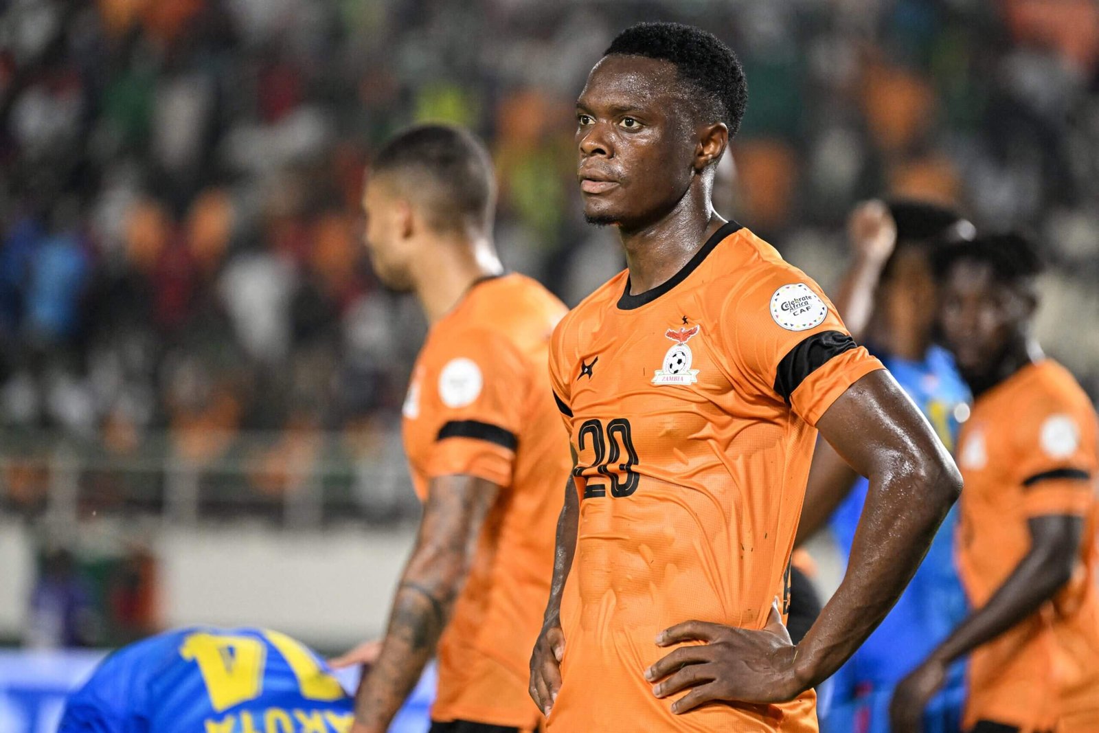
Zambia’s Patson Daka (Sia Kambou / AFP via Getty Images)
As with the Mozambique shirt, there’s just nothing to this, is there? Just a totally generic, plain shirt. The ‘orange is rarely dull’ rule does apply to a point here, but you would still like a bit more effort in the design. Plus the black bands on the sleeves makes it look like they’re permanently mourning someone.
Rating: 5/10
Read the full article here