This week in Boston, the NWSL’s latest franchise revealed its name and colors.
It should have been a cause for celebration… and it would have been had the name not been so monumentally stupid.
Bos Nation FC, a nonsense moniker chosen largely because Bos Nation is an anagram for Bostonian, those who hail from Boston. Every part of the brand reveal was botched — from the cringeworthy video to a marketing campaign that has been described by some as transphobic.
Within a day, the club had issued a public apology.
“Thank you to all who have held us accountable for calling for us to do better,” the club wrote on X. “We hear you and we will, together.”
From us to you. pic.twitter.com/ASHFHltb5n
— NWSL Boston (@NWSLBoston) October 16, 2024
An epic launch failure is new territory for the NWSL, which was founded in 2012. But observers of Major League Soccer, the American men’s top flight, are familiar with this sort of thing.
The league has a long and storied history of missing the mark with rebrands as it continues to reinvent itself. All of the original MLS clubs that remain have rebranded, some more than once. Even clubs that joined the league well after its inception have rebranded.
GO DEEPER
Boston NWSL club misses the mark with BOS Nation FC and marketing campaign
Some of those were successful: Sporting Kansas City performed a minor miracle when they shed their previous identity — the Kansas City Wizards — the same year they moved into a new stadium, becoming relevant and competitive almost overnight. Other rebrands have been too minor to offend, like the evolution of the crests of D.C. United or the San Jose Earthquakes.
But some have been truly terrible — and one was so bad that it got a fan arrested.
Here are the three worst rebrands in MLS history.

GO DEEPER
BOS Nation, a publicity campaign gone wrong and an apology for the hurt it caused
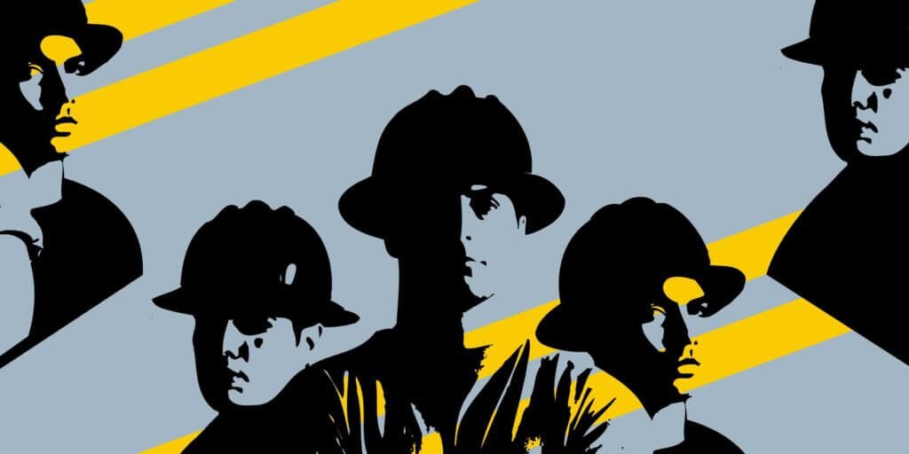
The original logo, a trio of construction workers, is arguably the most distinctive in MLS history. Designed by the artist Peter Moore — the man behind the Air Jordan sneaker, the Adidas equipment logo and U.S. Soccer’s “Denim Kit” — the crest was unabashedly American, a kitschy, unique design.
“The Crew’s name just fed into my desire to make this new league — and its teams — American,” Moore, who passed away in 2022, told The Athletic in 2021. “I was convinced a professional soccer league would fail if it were to be in the image of Manchester United, or Liverpool, or any of the traditional European clubs or leagues.”

GO DEEPER
Searching for the lost Columbus Crew: A journey from Jumpman to the Houston Texans for the truth
For years, the Crew embodied the logo, becoming one of the league’s grittiest, hardest-working franchises and they played in the league’s first soccer-specific stadium.
As decades passed, the Crew became one of the only franchises in the league to retain its original identity and logo. To some, the league had passed them by. That soccer-specific stadium, among the most historically-relevant soccer venues in the United States, became outdated. When new owner Anthony Precourt changed the logo in 2013, there were no pitchforks and angry mobs. His vision — a black-and-yellow roundel that incorporated design elements meant to represent the city of Columbus — was inoffensive. He made one other minor change, adding “Soccer Club” to the name. Some fans liked it.
Precourt, though, fell out of favor quickly. And by the time he stated his intention to move the Crew to Austin, Texas, he had become a hated figure. The “Save the Crew” movement was one of the most remarkable stories in this history of American soccer. Crew fans organized and saved the franchise from relocation, with Precourt being shipped off to start an expansion franchise in Austin. The movement solidified the relationship between the Crew and the city…
Which was why it was inexplicable when they rebranded again in 2021. The logo, shaped like the state pennant of Ohio, looked like clip art, devoid of identity. Most galling was the associated name change. Just years after fans “saved the Crew”, the club decided to go by Columbus SC.

The outrage was immediate. Among the first to respond was former Crew midfielder Justin Meram, who had amassed 206 appearances.
This makes 0.0000 sense. The history of the club is what’s most important, not another rebrand. Everyone in Columbus loves the Columbus CREW 👊🏼 🟡⚫️ https://t.co/zsCBJP23sD
— Justin Meram (@JustinMeram) May 9, 2021
The rebrand was driven by the Crew’s new ownership: gas station magnates and NFL owners Jimmy and Dee Haslam. They’d largely been viewed as saviors, having taken the reins from Precourt and having spearheaded the construction of a new stadium. Just two years into their ownership, the Crew won a league championship. But they badly fumbled this rebrand, and they were held to account.
Eventually, the Crew changed course, at least slightly. They kept the unsightly logo, but, importantly, they went back to calling themselves the Columbus Crew.
It’s an imperfect solution but, for now, the Crew live on.
Columbus’ rebrand was tone-deaf, entirely unnecessary and poorly executed — but it wasn’t offensively bad. Which brings us to the Chicago Fire.
No rebrand has been as poorly conceived and executed as this 2019 identity change. In their defence, no team has responded better to a botched rebrand than Chicago.
Soccer teams in the United States have long been named after natural disasters — think of the Dallas Tornado, Houston Hurricane or Earthquakes, to name a few. The Chicago Fire, though, were likely the first club to ever be named after a man-made disaster, paying homage to the Great Chicago Fire of 1871 that burned much of the city to the ground.
When the club joined the league in 1997, the name was unique and the crest was among the best. Derived from the cross of Saint Florian — a symbol commonly used by fire departments across the United States — the Fire’s general manager, Peter Wilt, helped craft an identity that felt timeless and classic. Executives at MLS and at Nike, the club’s equipment supplier, wanted a different name, the Chicago Rhythm, and an accompanying logo plucked straight out of a 1990s fever dream, a pair of dueling yellow and purple cobras. Wilt and Fire ownership pushed back, and the Fire won out.
The name, though, had one massive shortfall, which Wilt and others never could have predicted. As the internet became ubiquitous, the Fire sunk further into search-engine obscurity, drowned out at first by the 1871 disaster and then by a wildly popular NBC drama, Chicago Fire, which still buries the team well down the page. And by the time the club left suburban Bridgeview for downtown Chicago in 2019, a small group of executives felt a rebrand was in order.
What they came up with made the Rhythm identity look tasteful. When the design leaked on social, it was rightly and roundly panned. The Fire’s long-suffering fanbase, who at that point had endured a decade of irrelevance and mismanagement on and off the field, pushed back immediately.

GO DEEPER
Digging deep into the Chicago Fire’s poorly received rebrand
The design — a trio of mirrored triangles meant to embody the city’s rise from the ashes of the Great Chicago Fire, made no sense. It was a low-resolution mishmash that looked strangely similar to the logo of the Vancouver Whitecaps. What’s more, the triangles formed a crown of sorts and that crown, along with the yellow coloring of it, evoked the logo of the Latin Kings, a ruthless street gang formed in the 1950s in Chicago proper.
And there was a minor tweak to the club’s name itself, as they migrated from SC to FC, replacing soccer with the more globally-adopted nomenclature.
— X – Vancouver Whitecaps FC (@WhitecapsFC) November 21, 2019
At first, the club held fast, saying that logos and rebrands are “judged in years, not days”. By the time current owner Joe Mansueto took over, though, the Fire plotted a different direction and enlisted the help of renowned designer Matthew Wolff, who crafted the club’s current crest.
They listened to fans and to the community, most of whom asked for the return of the Florian cross, among other design elements. The new logo has much of the same timeless energy as the original.
CF Montreal
North of the border, Canadian side CF Montreal’s transformation ended with their own fans leading a minor revolt.
The Montreal Impact were founded in 1992, four years before MLS began play and navigated the myriad lower divisions of American soccer over their first 15 years. The club was well-regarded and supported locally, and when they made the leap to MLS in 2012, they adjusted their crest but kept their name.
The Impact’s original MLS identity incorporated the fleur-de-lis, an easily recognisable symbol of French heritage.
During their time in MLS, the Impact earned a reputation for being one of the most dysfunctional franchises in the league, with owner Joey Saputo sometimes perceived as a loose cannon. The club strung together a series of terrible seasons in the late 2010s and early 2020s. Saputo’s solution was to rebrand the club. In 2021, the Montreal Impact became Club de Foot Montreal — CF Montreal for short, changing their logo and colors to boot.
“It’s hard to let go of things you love,” said Saputo. “But here’s the reality: to make an impact, we need to retire the Impact.”

GO DEEPER
Will becoming Club de Foot have an Impact for Montreal?
Gone was the fleur-de-lis, replaced by a stylized snowflake. The crest was far from atrocious, but Montreal’s supporters were furious.

About 50 supporters braved the February cold to protest outside the club’s home, Stade Saputo. Things quickly got ugly when one supporter defaced a sign bearing the club’s new logo, almost certainly becoming the only person in MLS history arrested for protesting a rebrand.
Fans did not let up. For the first time in club history, attendance began to suffer.
Saputo’s response, in 2022, was to walk back the rebrand halfway: the club is still known as CF Montreal, but the colors reverted to the original blue and black and the club’s latest logo features the iconic fleur-de-lis. It’s an imperfect solution, but it’s better than nothing.
(Top images: Chicago Fire FC; Club de Foot Montreal)
Read the full article here


